Learn about shortcodes
To add a button to your website, you will use a button shortcode.
A shortcode is a unique tag that allows you to pull predefined content, functions and more into your posts and pages. They are essentially shortcuts to inserting dynamic content and design: Shortcode = Shortcut + Code.
Add a button
To start, log in to your website > go to Pages > select the page you want to add a button to.
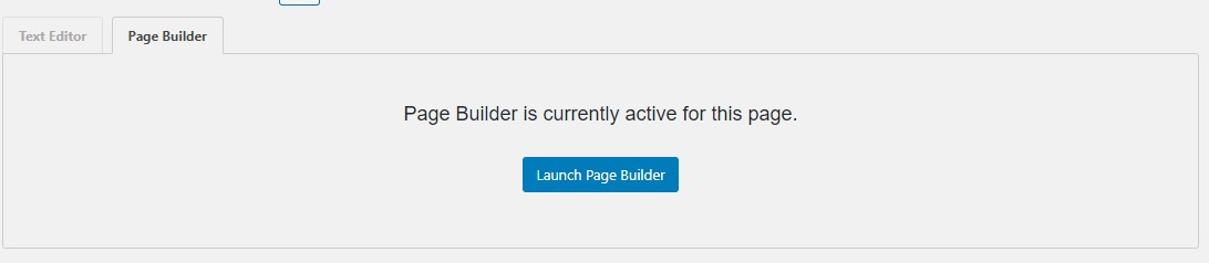
Note: If you see the following - "Page Builder is currently active for this page", you will add a button through the page builder and not with shortcodes. Click here to go to the Page Builder button tutorial.
Within a "content" area, you will add the button's shortcode. Example:
[button link="insert link here"] This is the text for the button [/button]
Single button
To give emphasis to a link, you may want it to appear as a button. We've set your base button styles when creating your theme and you can use them with the following shortcode:
[button link="insert link here"] This is the text for the button [/button]
Which will output: (color and font styles dependent on your theme)
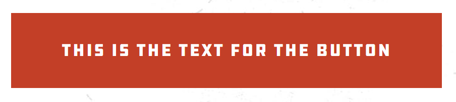
This is the minimum customization you'll need - just a link and the text of the button. The color will default to your primary brand color and will be a medium size.
Customizing the button:
Add an arrow : left, right
Style options: solid (default, no need to set), inverse (which takes your designated color to create an outline and no fill)
[button link="google.com" size="large" color="brand-secondary" arrow="right" style="inverse"]Take Me to Google[/button]
Example:
Example output: (style dependent on your theme)

Open button's link in new tab
To have your button's link open in a new tab, include the following in your button's shortcode: target="_blank"
[button link="google.com" target="_blank"]Take Me to Google[/button] - Notice the underscore!
Button Alignment & Width
Width
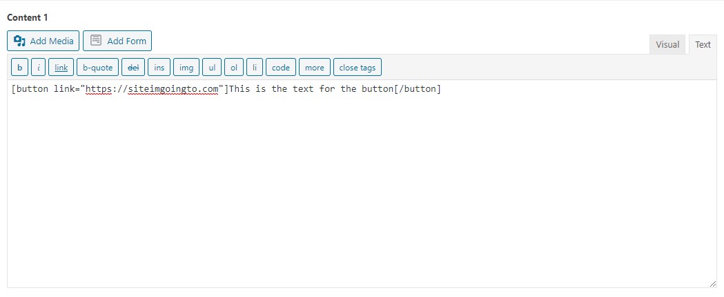
By default, the width of your button is determined by the length of the button text. In some cases, you may want the button to span the width of the entire content container.
To force your button to span the full width of its container, add the following option to your shortcode: display="full-width"
[button link="https://siteimgoingto.com" display="full-width"]This is the text for the button[/button]
Alignment
By default, when not displayed full width, buttons are left-aligned. Occasionally, you may want the buttons to align center or right. In this case, there's no need to customize the shortcode, you'll simply select/ highlight the shortcode text in the content editor and use the alignment buttons, shown highlighted below. This works for single buttons and button groups.

Adding a Group of Buttons
If you would like to add a group of buttons, the way you enter the button shortcode into the editor will determine how they display.
If you add each shortcode on its own line, similarly, each button will be stacked on top of each other:
[button link="mysite.com"]Button 1[/button]
[button link="mysite.com"]Button 2[/button]
[button link="mysite.com"]Button 3[/button]
Example's output:

If you add the button shortcode on one line simply separated by spaces, the buttons will display in a horizontal row:
[button link="mysite.com"]Button 1[/button] [button link="mysite.com"]Button 2[/button] [button link="mysite.com"]Button 3[/button]
Example output:

Add a button with the Page Builder
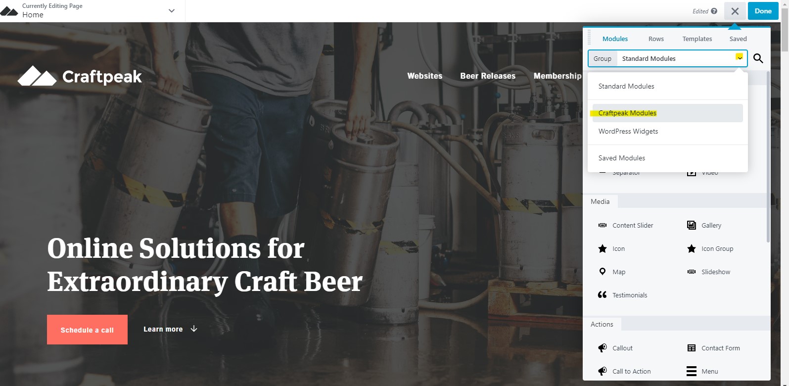
If the page you want to add a button to has the page builder active, click the blue "Launch Page Builder" button.
Once in the page builder, click the top right "+" beside the blue "Done" button. You will want to click the drop down "Group" options and select "Craftpeak Modules" (the Craftpeak Modules will pull in the programmed style options):
In the sidebar, scroll down until you see "Buttons":
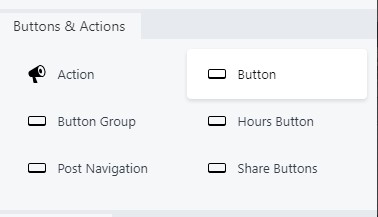
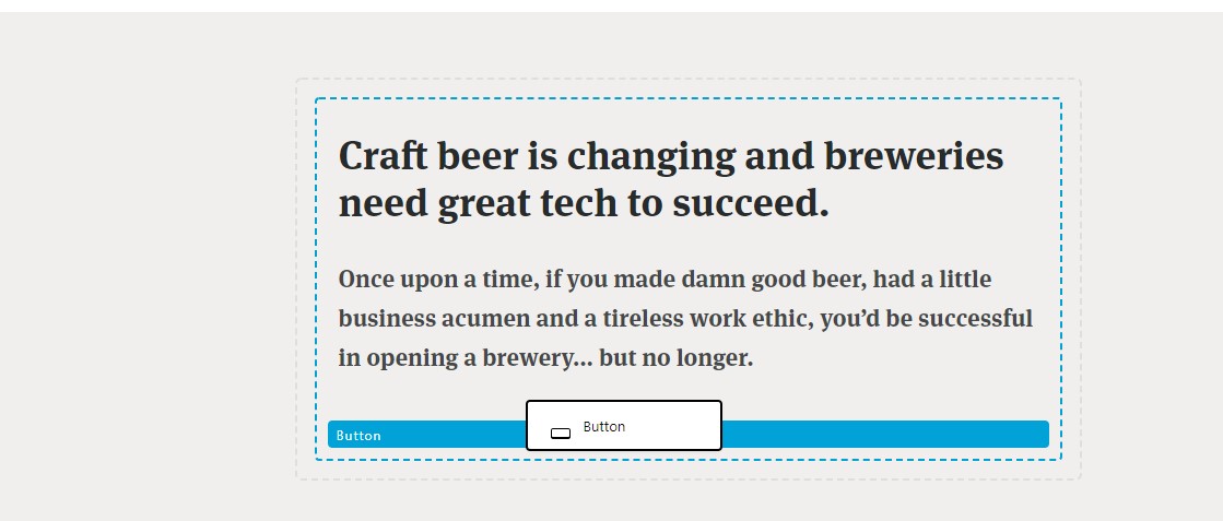
Drag the "Button" into the section of the page that you want a button. Make sure it's inside a container:
A window to edit the button's settings will open:
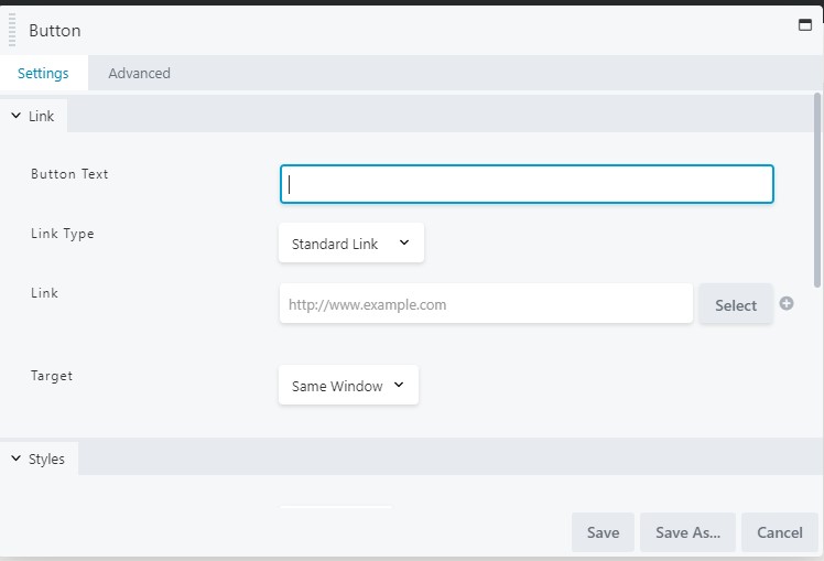
Here are the settings within this window (within the "Settings" tab, please do not change settings in the "Advanced" tab):
- Button Text: This is what you want the button to display
- Link type: If you want the button's link to open as a normal link or as a popup window
- Link: Enter the website address of the website/page you want the button to link to
- Target: Same Window (opens the link in the current window) or New Window (opens the link in a new window
- Color: These settings are already programmed by Craftpeak depending on your website's color theme.
- Size: Select the button size
- Style: Normal or Inverse (inverse will make the button's color inverse)
- Arrow: Here you can add an arrow to your button
- Display: Full Width if you want the button to span the container you dragged it into
- Align Button: The default is Left, so you can choose other alignments.
When you have made your selections, press "Save". After, press the blue "Done" button > "Publish" in the top right to publish your changes. It's always a good idea to test your button after publishing to make sure it is connecting to the correct link.